Friday, May 28, 2010

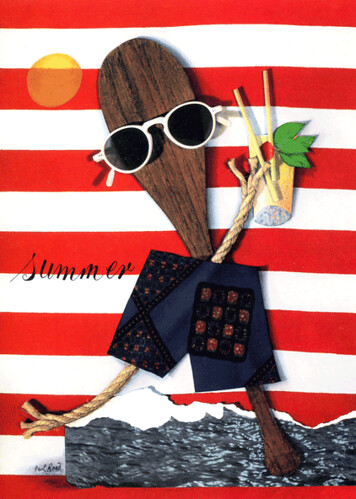
(Kelly) Graphic Design 2: Paul Rand

Paul Rand (born Peretz Rosenbaum, August 15, 1914 – November 26, 1996) was a well-known American graphic designer. Though Rand was educated at the Pratt Institute, the Parsons School of Design, and the Art Students League, he was by-and-large self-taught as a designer.

He was one of the originators of the Swiss Style of graphic design (a style developed in Switzerland in the 1950s that emphasizes cleanliness, readability and objectivity.)


As a well versed designer, advertiser, illustrator, artist and industrial designer, Rand is mostly noted by his corporate identity work; IBM, Ford, ABC and UPS were some of his largest clients. Practically working as a freelancer, Rand single handedly raised the value of designers with his identity work, giving graphic value to these companies who’s logos has been relatively untouched - some for over 25 years.


Rand drew his knowledge and creativeness from the resources of this country. He was an idealist and a realist, using the language of the poet and business man. He thought in terms of need and function. He was able to analyse his problems but his fantasy was boundless.
  • In 1937, launched his first career at Esquire
  • He spent fourteen years in advertising
  • He taught at Pratt Institute in 1946; in 1956 he accepted a post at Yale University's graduate school of design where he held the title of Professor of Graphic Design
  • He was cited as one of the ten best art directors by the Museum of Modern Art
  • Rand was inducted into the New York Art Directors Club Hall of Fame in 1972.

"Design can be art. Design can be aesthetics. Design is so simple, that's why it is so complicated." – Paul Rand, 1997


Wikipedia

Paul-Rand.com
Area of Design
Think Exist Quotes
YouTube.com Video

Tuesday, May 25, 2010

Frank Kozik - SAM


Frank Kozik

Frank was born in Madrid, Spain in 1962.
At the age of 14 he moved to the United states and settled in Austin, Texas.
He is credited with single handedly reviving the 'lost' art of the concert poster, Franks creative career grew largely out of his enthusiasm for Austin's growing underground rock scene in the mid-eighties.


He started his career by making black and white flyers for his friends bands.

His reputation grew as an artist whose work was arresting and gripping.
Kozik has done over 60 gallery shows world wide with multiple exhibits in Tokyo and London.
Kozik has done graphic design for dozens of makor companies such as, Nike, BASF and gatorade.

He has also directed music videos for soundgarden and mint condition.
He is currently based in San Francisco, California
where he produces artwork and graphics, and formerly managed his own record label, mans ruin as well as Rise Records. His work is well known to devotees of album-cover art and concert flyer art. He has produced artwork for musicians such as Pearl Jam, Nirvana, Soundgarden, Nine Inch Nails, Neil Young, Sonic Youth, Red Hot Chili Peppers, Janes Addiction, Green Day and many more.
Kozik has also designed a pair of Artist Edition Oakley sunglasses.

Three volumes of his collected poster and album cover designs have been published and are widely available. A new Book, Plasticland, published by Dark Horse Publications was released in January 2008 and is a photo essay of his last 4 years work as a toy designer. Kozik also edited and published Panda Meat, a volume of contemporary gig poster designers.

Kozik has retired from poster design, He has teamed up numerous times with such entities as Kid Robot, Toy2R, Adfunture, Jamungo and others and is credited with such creations as Smokin Lorbits, the Hate Dunny, Dr. Bomb, Mongers, Chumps and more. He is currently one of the most prolific and popular designers in the genre. He has also done hand painted editions of several RealxHead Kaiju toys.

Most recently in 2008 in collaboration with Draven Shoes, Frank has issued a line of Footwear that bears his name and art work. The collection for now can be viewed as some items purchased on Draven's Official Website.

Links -
http://nevermindgallery.com/index.php?cPath=378_176_409
http://en.wikipedia.org/wiki/Frank_Kozik
http://www.frankkozik.net/
http://www.gigposters.com/designers.php?designer=2386
http://www.myplasticheart.com/c/01FKOZIK/Frank+Kozik.html

Ikko Tanaka


IKKO TANAKA 1930
-2002


Ikko Tanaka born 1930 in
Nara, the first permanent capital of Japan, where he studied art as a child. He was one of the greatest Japanese Poster Designers. A master of the fine arts of Japanese calligraphy and an expert with Western Typography. His ultimate mission was beauty-creating elegance
and simplicity through a strict adherence to basic geometric form. He borrowed simple shapes and patterns of ancient arts and incorporated them into designs.

He graduated from the Kyoto City School of Fine Arts and began working in the early 1950's. Then in 1963 designed a studio in Tokyo. Ikko presents himself with grace, humility and natural expertise and is well known for being someone that did not care for public lectures or guest appearances in academic circles.

Tanaka's Japanese poster and publication designs consisted of Japanese tradition and the International style which helped create modern artworks. In
his designs he succeeded in gripping the strong and clean, colourful and playful, past and present graphic compositions and also consisting
a deep influence of Japanese Culture- this made him unique among his colleagues.

Expanded his work by not only doing posters and booklets for cultural organisations, he also designed logos, packaged designs and annual reports for brands Hanae Mori, Issey Miyake and Mazda.

His best known poster was the abstract feature of a geisha for the Asian Performing Arts Institute in 1981. At first glance the design seems to only consist solely of a series of rectangles and squares. But looking closer, the geometric jumble morphs into the figure of a woman's head.
Because the head of the woman is turned towards the audience, it creates a sense of motion. The background of the poster is the Japan's rising sun. Through the single placement he establishes an effect of shadows and depth.

Most of Ikko's images pay homage to old
representatives of Kabuki - a Japanese Dance theatre- while others are more abstract with a Western Op Art flavour.

Ikko wasn't trapped under a nation's expectations for success a
nd had with nothing to prove so that he was free to experiment with colour and form. With his use of bold colour he expanded the possibilities of Japanese graphic design, by using colour in a syncopated manner in order to express frivolity.

Tanaka is one of the leaders of the commercial art world as a graphic designer, art director and editor for a series of books and Japanese culture. He became involved in modern drama and joined the Atelier-za theatrical study group when he moved to Kyoto.
Whilst in Kyoto he became acquainted with Kabuki and Hokusai's 19th Century wood block prints.

According to Tanaka, graphic design is intended to communicate to a general public. Much like posters, as they are everyday vehicles of beauty and values that must be articulate.

He was a member of the Tokyo ADC, AGI, and the NY ADC Hall of Fame. And also created an on-person exhibition in New York, Los Angeles, and Mexico.

Ikko;s awards include: JAAC Special Selection
Mainichi Design Awards
Minister of Education Newcomer Prize
TOKYO ADC Member's Grand Prize
Mainichi Art Award
Purple ribbon Medal

New York ADC Hall of Fame Prize


He died on January 11th 2002, at the age of 71, from a heart attack.


http://www.nytimes.com/2002/01/24/arts/ikko-tanaka-71-japanese-graphic-designer.html http://www.artandculture.com/users/576-ikko-tanaka http://www.tdctokyo.org/awards/award95/95membergold_e.html http://en.wikipedia.org/wiki/Ikko_Tanaka http://www.amazon.com/Tanaka-Ikko-Gian-Carlo-Calza/dp/0714837164

Nick iconic chairs eames lounge 670


Eames lounge was first designed in 1956 by Charles and Ray Eames for the Herman Miller Furniture Company. The design is quite basic looks really outdated and boring for this day and age but back then would have been really classy and stylish defiantly looks really comfortable and is a very practical design evolving style and comfort. Design is made up of three plywood shells each made five layers of ply, the original versions used Brazilian Rosewood whereas the later versions use wooden vener and seven layers of ply. The chairs first time on television was the Arlene Francis show "Home" on the NBC network in 1956 the chair soon became a design icon. Print ads decipted the 670 in a Victorian Parlor, occupied by a grandmother shelling peas on the front porch of an American Gothic style house, and in the middle of a sunny field of hay. Eames for Herman Miller produced an ad warning customers against imitations. the Eames lounge is a very succesful design copies are still being made today and there have been many successful alterations.

http://en.wikipedia.org/wiki/Eames_Lounge_Chair

http://www.wright20.com/auctions/view/JKMK/JKML/635/LA/none/JXOW/1

http://www.designaddict.com/design_index/index.cfm/fuseaction/designer_show_one/DESIGNER_ID/63/

http://www.deconet.com/product/132077/670_Lounge_Chair_and_671_Ottoman_by_Charles_&_Ray_Eames

http://designmuseum.org/design/plywood

Monday, May 24, 2010

Cilla: René Gruau

Rene Gruau (4 February 1909 - 31 March 2004) born to an aristocratic Italian father and a French mother, Marie GRUAU, whose name he took.

In 1924 Gruau settled in Paris and embarked on his career as a fashion illustrator. His earliest drawings were published in Italy, Germany and England.


Gruau became one of the best known and favorite artists of the haute couture world during the 1940s and 50s working with Femina, Marie-Claire, L'Officiel, L'Album Du Figaro and an assortment of “high-style” magazines. Gruau’s artwork is recognized and commended internationally in some of Paris and Italy's most prestigious art museums including the Louvre in Paris and the blank in Italy. In addition to his international fame and recognition,"Gruau's artwork is known for its timeless and enduring style".


Gruau’s exaggerated portrayal of fashion design through painting has had a lasting effect on the fashion industry . His inherent skills and creativity, contributed to a change in the entire fashion industry through the new pictures that represented the already popular designs created by designers in the industry. The benefits, including economic stimulation and enhancement of advertising are still vividly presented in the industry today via a new way of fashion illustration, fashion photography.


In 1948 Rene Gruau left for the United States to work for Harper’s Bazaar and Vogue, before becoming the exclusive artist for FLAIR. He also produced stunningly beautiful advertisements for the LIDO, MOULIN ROUGE and BEMBERG. Almost right up until his death at the age of 95, Gruau continued to work for the greatest names in Haute Couture: Balmain, Fath, Schiaparelli, Balenciaga, Givenchy, Rochas while also producing fashion drawings for ELLE, Vogue, France, Madame Figaro and L'Officiel de la Couture.


Today Gruau’s works are collected and exhibited by the finest art institutions including the Louvre in Paris.


http://en.wikipedia.org/wiki/Rene_Gruau
http://www.renegruau.com/gruau_artist/index.html
http://www.americanfineartgallery.com/artist_bios/gruau_bio.html
http://www.artnet.com/artist/641308/rene-gruau.html
http://www.britannica.com/EBchecked/topic/1014505/Rene-Gruau

Betty - Stefan Sagmeister


Stefan Sagmeister (born 1962 in Bregenz, Austria) is a New York-based graphic designer and typographer currently living in Bali, Indonesia. He has his own design firm—Sagmeister Inc.—in New York City. He has designed album covers for Lou Reed, OK Go, The Rolling Stones, David Byrne, Aerosmith and Pat Metheny
born in 1962, bregenz, austria. stefan sagmeister studied graphic design at the university of applied arts in vienna. in 1987 he moved to new york to attended pratt institute on a fulbright scholarship.
he then returned to austria in 1990 for community service as an alternative to obligatory military conscription.
at the age 29, he attained a job with leo burnett hong kong.
in 1993 he returned to new york to work for the hungarian graphic designer tibor kalman at M&Co. when the studio closed the same year, sagmeister opened his own office ‘sagmeister inc’. in 1994 he was nominated for a grammy award for his album cover - 'h. p. zinker mountains of madness’.
in the following years he designed album packaging for artists such as david byrne, lou reed and the rolling stones.
in 1996 sagmeister began developed posters for AIGA-american institue of graphic arts-he took a ‘year out’ in 1999, closing his studio to commercial work and concentrating on his own experimental projects. in 2001 released the book ‘made you look (another self-indulgent design monograph)’.
in 2005 he won a grammy award as art director of the ‘once in a lifetime’ talking heads boxed set packaging.
currently among many projects sagmeister continues his work on ‘20 things in my life I have learned so far.’ a series of typographic pieces inspired by the work of his grandfather that he began in 2004.
http://www.sagmeister.com/index.html
http://en.wikipedia.org/wiki/Stefan_Sagmeister
http://www.43folders.com/2007/06/14/stefan-sagmeister-on-design-and-happiness

STACY: GRAPHIC DESIGN 2

Choose one of the following graphic designers and make a post of 200 words 5 images and 5 links

saul bass
banksy
massimo vignelli
erik speikerman
shepard fairey
alec troucht
neville brody
paul rand
lester beale
herb lubalin
alvin lustig
shag
tibor kalman
Frank Kozik
Jan Lenica
Masuteru Aoba
Ikko Tanaka
Rick Griffen
Reg Mombassa
René Gruau